
What I Use to Organize my Paints
This might be too many watercolors for my own good! I also keep the swatches of paints I’ve used up and no longer have, just in case I want to go back and get some more one day!
“All you need are the primary colors”
You’ve heard it a million times. It’s Color Mixing 101. And while it might be true in theory, I haven’t found it to be the case in practice.
I have a lot more in my palette than just one red, yellow, and blue and I use my secondary, tertiary, and straight up unusual watercolors all the time. Do I actually need all the colors I have? Nope. But I’m always on the hunt for the perfect non-granulating sky blue, the best neutral transparent brown, etc. And to be honest, I love testing out new companies and pigments just for fun too.
tl;dr - I buy a lot of paint
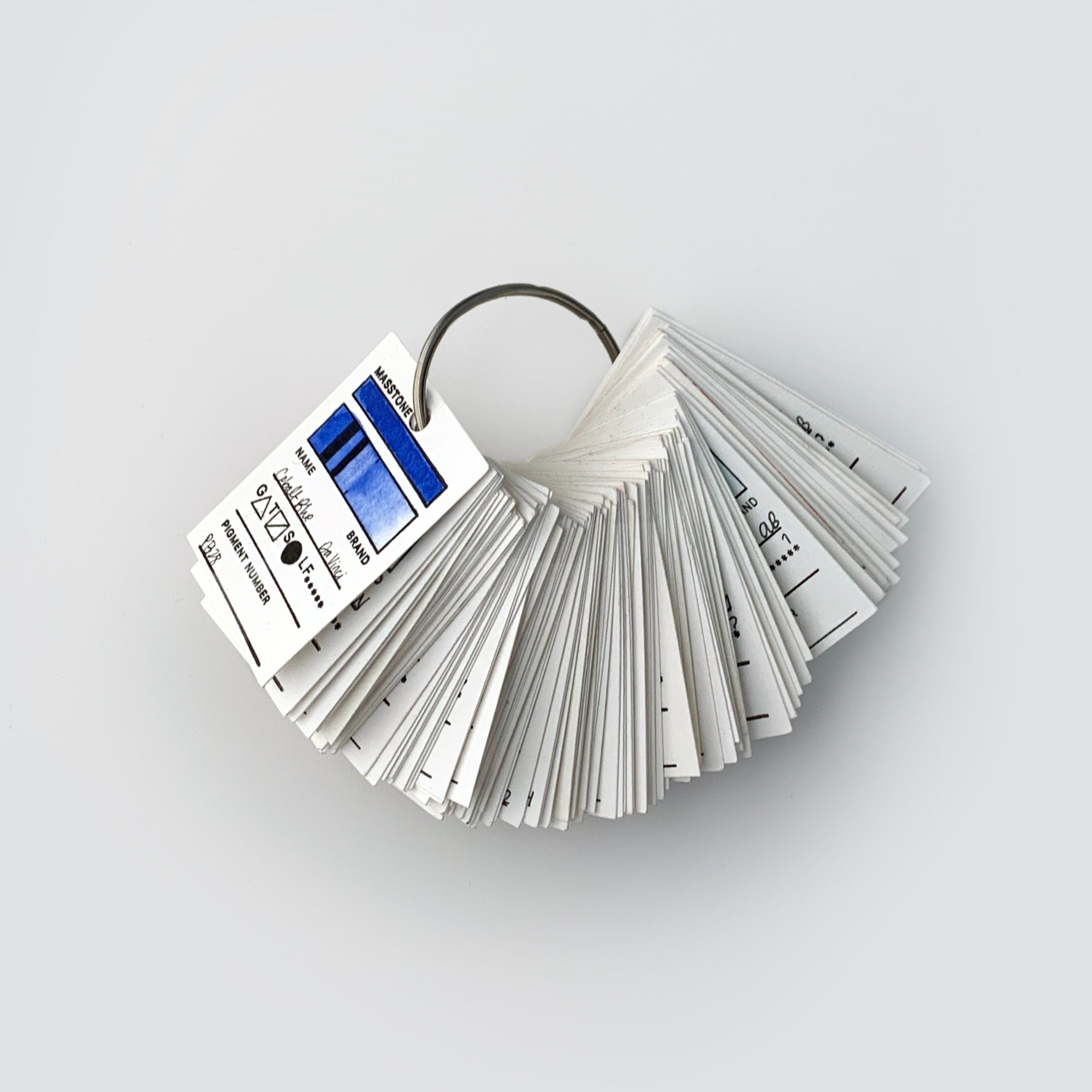
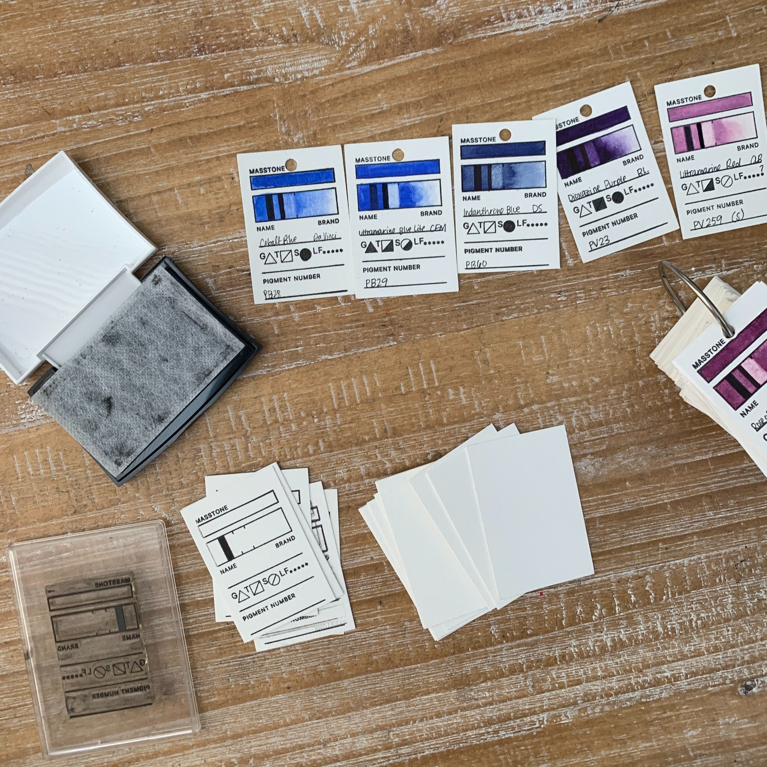
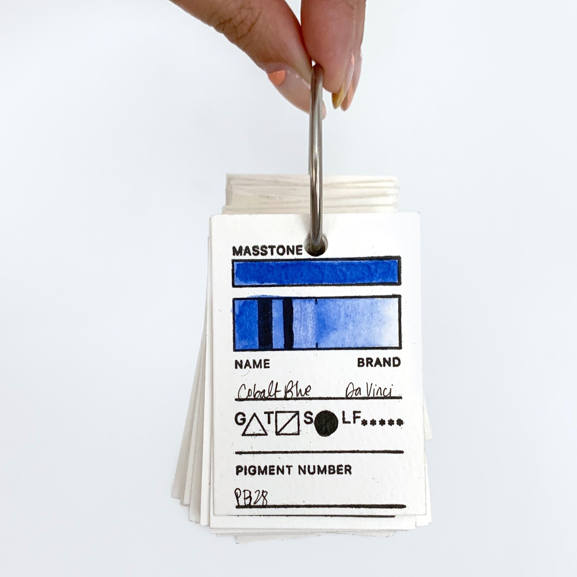
If you have multiple colors or even multiple palettes (like I do), it’s really helpful to have a way of categorizing and quickly referring to each of those colors. That’s why I have my swatch deck. Each of these cards highlights one specific color - its name, brand, pigment number(s), and properties (staining, granulating, transparency, and lightfastness).
At this point, I have so many paints that I’ve hole punched each swatch card and put them on a key ring in rough rainbow order so that I can quickly refer back while I’m painting. This is super helpful for things like:
Is this brown granulating? Then I won’t use it while mixing a skin tone that I want to blend more seamlessly.
Which of my yellows is most transparent and would be best for glazing some sunshine onto a sidewalk?
When laying out my newest puzzle design (coming soon!) I wasn’t always sure which color I wanted to put where. Taking out all of my favorite colors in their swatch form allowed me to visualize, rearrange, and edit down my design so I had the exact arrangement of all 42 colors that I was looking for. Interested to hear more? Check out the “New Puzzle” highlight reel on my Instagram here to see more of the planning process.
Let me show you how I fill them out and where you can get the materials!
the materials:
For my swatch deck, I use:
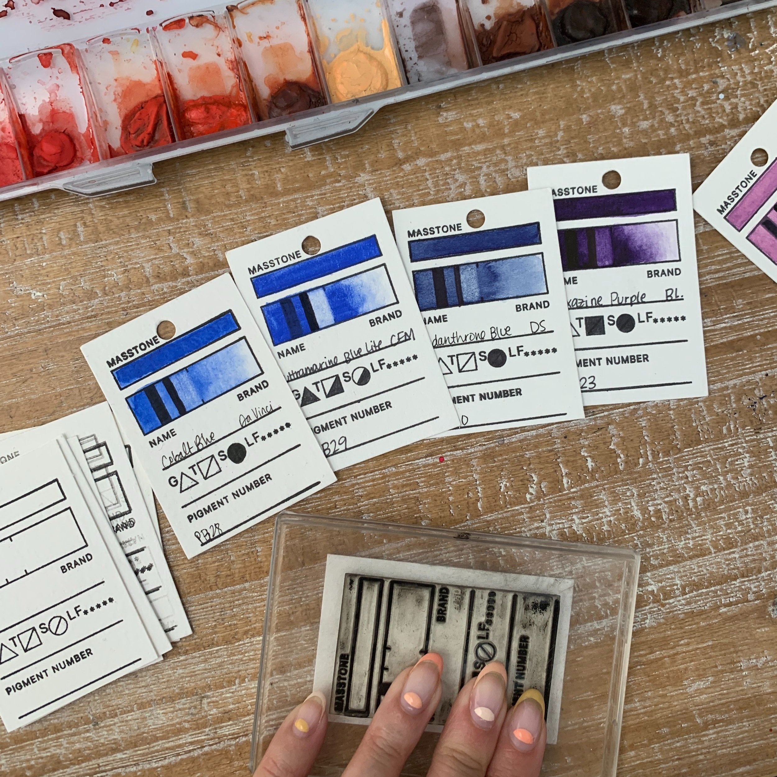
The Waffle Flower Swatch Stamp (sold here). This is a clear, adhesive-backed stamp that I mounted on top of a clear plastic container lid so that I can see where I’m stamping. Conveniently, the plastic container beneath the lid also holds my stamp pad and extra cut sheets of paper so I can keep everything in one place.
A Versafine Onyx Black Ink Pad (sold here). The ink is waterproof once dry and it’s the perfect size for the stamp. I’ve been using the same pad for years and haven’t had to replace it!
Canson XL Watercolor Paper (sold here). When initially putting this together, I’m glad that I had enough foresight to make sure I put all of my swatches on an easily re-purchasable, not super expensive watercolor paper. That way they’re easily comparable (because they’re on the same color paper) and they can be for quite some time!
A single hole punch (like this one here). It’s nothing fancy and it does the trick!
A plain black Sharpie (like this one or the one I’m sure is sitting in your junk drawer). Any waterproof black marker will do!
And lastly, a hinged craft ring (like these ones here). If you are assembling these on a ring, I’d recommend a hinged one rather than a classic key ring. It makes it easier to take them off and reorder them!
FYI: Some of the above are affiliate links. When you use them to shop, you’ll also be supporting me ☻
How to Fill it Out
When I first got this stamp set, I had a lot of questions about how to fill out all the symbols. Here’s a quick and dirty guide to what each symbol means and how I fill mine out!
Of course, this is all subjective! Fill yours out in whatever order and language makes sense to you.
Fill out the Masstone - this is the color when it’s straight out of the tube / pan (with enough water to get it even).
Using a sharpie, retrace Line 1. (The stamp includes a black line in the gradient section but sometimes I mess it up so I use a Sharpie to get it nice and densely black).
Then paint the gradient, using the Masstone on the left and washing it out into plain water on the right.
Next, I let that dry and fill in the name, brand, pigment number and lightfastness. All of which will be on the packaging or manufacturer’s site.
Once the gradient is dry, I take a short bristled brush and I lightly scrub in Area 3 and dab it with a paper towel to lift off the color.
I’ll take the Sharpie again to color over Line 2 for the Transparency comparison.
Now, I have all the info I need to fill in the Transparency, Staining, and Granulation tests!
HOPE THIS WAS HELPFUL!
If you have another way that you organize your watercolor paints, I would love to hear about it! I’ve seen some artists put together poster-size color charts with each color (which looks so cool) and many artists, myself including, make maps for each individual palette. One of the reasons I love this method is that it allows me to get to know my paints even better - otherwise, I may never have taken the time to know their properties and pigments.
Let me know what you think!
Best,
